7 Seconds. That's All You Have to Win a Donor

First Impressions Are Fundraising Moments
You have about seven seconds. That's the average time a first-time visitor spends deciding whether to stay on your website or leave. For nonprofits, those seven seconds aren't just a UX metric — they're a fundraising moment. And most nonprofit websites are quietly fumbling it.
The problem isn't passion or purpose. Every organization we work with has both in abundance. The problem is that the website wasn't designed with the donor journey in mind. It was designed around the organization's internal structure — programs, staff bios, board pages — rather than the experience of a stranger landing on the homepage for the first time.
The Donate Button Isn't Enough
One of the most common mistakes we see is over-relying on a "Donate" button to do all the heavy lifting. The button matters, but what comes before it matters more. Before someone clicks donate, they need to:
- Understand what your organization actually does (in plain language, in under 10 words)
- Feel the urgency or importance of the problem you're solving
- Trust that their money will be used well
- See themselves as someone who gives to causes like this
Most nonprofit websites skip straight to the ask without laying this groundwork. The result? High bounce rates and low conversion — even when your mission is compelling.
Slow Load Times Are a Silent Killer
In the nonprofit world, websites often get built once and left alone for years. Plugins stack up, images never get compressed, and mobile performance deteriorates. The data is clear: a one-second delay in page load can reduce conversions by up to 7%. On a $50,000 annual fundraising goal, that's real money walking out the door.
Run your site through Google PageSpeed Insights right now. If your mobile score is below 70, you have a problem worth fixing before your next campaign launches.
Mobile First, Always
More than 60% of nonprofit website traffic now comes from mobile devices — and that number skews even higher during giving campaigns tied to social media. Yet many nonprofit sites were built desktop-first and mobile-adapted as an afterthought. Tiny tap targets, horizontal scrolling, and donation forms that don't work on a phone are costing you donors who would have given if the experience had been smoother.
Trust Signals That Actually Work
Donors want to trust you before they give. That trust isn't built by listing your mission statement — it's built through specificity. Photos of real people you serve (with their permission). Program impact numbers that are concrete, not vague. A clear explanation of how funds are used. Third-party credibility markers like Charity Navigator ratings or GuideStar seals. Testimonials from people whose lives have changed because of your work.
The organizations that raise the most online aren't always the largest — they're the ones that have learned to communicate trust quickly and clearly.
What to Do This Week
You don't need a full redesign to make an impact. Start with these three things: First, rewrite your homepage headline so a stranger can understand what you do in one sentence. Second, check your donation form on a mobile device and time how long it takes to complete. Third, add one concrete impact stat ("We've served 4,200 families since 2018") above the fold on your homepage. These small changes can meaningfully improve your conversion rate while you plan bigger improvements.
Your website should work as hard as your team does. If it isn't, that's the most urgent communications investment you can make.

What Your Nonprofit's GA4 Data Is Actually Telling You
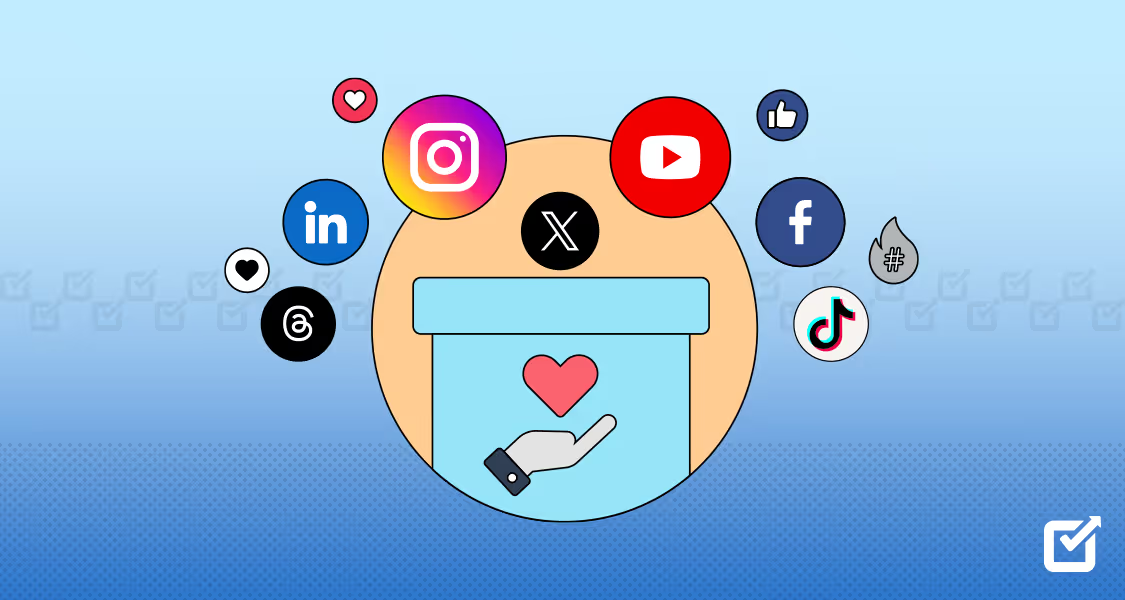
Enhancing your Nonprofit's Social Media impact